1. Make a person that hold a shiny sphere that reflects the courtyard when it should reflect their face.
2. Create a never-ending staircase using the blue/green stairs in the courtyard.
3. Make the Mods float over a tennis court and be held in place by cables.
4. Make the courtyard ground look shiny, like water, leave the patches of land as islands and have people look like they're swimming possibly create ripples in the water.
5. Take a picture of the pod from a ground angle then from an above angle and put one on the cieling like a reflection.
6. Create a common sense crossing out of a hallway in the school, make some people walk on the cieling and some on the wall.
7. Place a giant reflective ball in the junior lot and have people stand around it and have it reflect upside down like a bubble.
8. Make a live cougar come out of one of the large cougar paintings around the school, would be interesting to use one of the giant paintings in the gym.
9. Make a student grow out of one of the patches of dirt in the courtyard and leave a sign next to it saying "AHS Student" like the signs in the gardening section of stores saying what flower's what.
10. Shiny spheres hanging around the courtyard from the sky, have some people look at the spheres confused and have some point and act surprised.
Wednesday, March 30, 2011
Tuesday, March 29, 2011
Themed Project 3: Promotion items


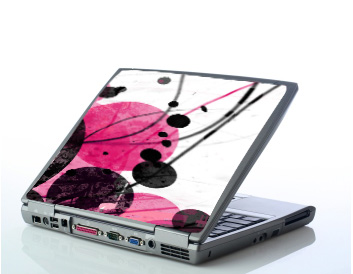
2. I think it's fairly successful, although I did use too much of the pink version of it. I really like how the iphone cases turned out.
3. It worked well that I only used technology it fits well with the theme, and I really like how I was able to recreate the broken text from the original Broken picture. Experimenting with the blending options made a variety in the iphone cases that made it very interesting.
4. If I could do it again, I would probably choose a different laptop to use, the dell isn't very attractive in my opinion, but it was the simplest one.
5. The most difficult part was recreating the text on the ipod, since I couldn't get the old text, so it was fun recreating it... even though it was super tedious.
6. I learned a lot about how different blending options can create different colors and effects and repeating the same picture on each case but changing the blending options can create very different color schemes and effects.
Thursday, March 24, 2011
Broken


1. I really like the piece, and it was really fun to make. The text at the bottom was very tedious to make but looks really cool in the end.
2. I think it's very successful, the colors are simple, but bright, and the design is not too over powering. Before I adjusted the blending on the layers, it was a very overpowering piece, but I really like the way it looks merged on the bubbles.
3. I wish I had done a bit more in the corner, but I like the piece anyway. It all flows to the bottom left, then the lines lead it to the top right corner, but I think there's too much of a space between the lines and the text at the bottom, it probably could be fixed with a few small/medium bubbles.
4. If I did it again, I would probably try to use a few more shades of orange, I used only the orange on one part of the laptop, I should have used darker and lighter colors, but I compensated by changing the opacity of the color and basicly achieving the same effect.
5. The most difficult part was the text, it may not look like much, but selecting little bits and moving it just slightly and trying not to move pieces of the next letter was very tedious, and a little annoying. But, I like how it looks.
6. I learned alot about changing the opacity and selecting small selections. As well as changing the blending of layers.
Monday, March 21, 2011
Newimal

2. I think it's fairly successful, the blending made the wings fit with the frog and there's no real harsh differences in color.
3. The tail and the frog definately worked, but the wings were very stubborn to get to look like that and it would have been difficult to make the color scheme match perfectly. The tips of the feathers are to light and such..
4. If I could do it again, I probably wouldn't have chosen such a monotone animal, there may be a bit of brown but it's mostly a green frog, on a green leaf of some sort.
5. The most difficult part was making the wings the right color, it took alot of sampling colors and blending them. The back wing was probably the most annoying, it really wanted to be white.
6. I learned a bit about burning and dodging the colors, I used it a lot on the wings to get the dark and lights looking right, I wish I had added a bit of shine on them to make them seem frog-flesh-like..
Thursday, March 17, 2011
Brush Composition: Game

2. It's very successful, but the sackboy seems to be overpowering the piece.
3. The color scheme worked very well for this piece, black and white always looks good. The only thing that I kept getting stuck on was the biker, it was too small to put anywhere, but I wanted it in there somewhere.
4. If I could do it again, I would use more games with smaller pictures flying out instead of being ontop of the controler.
5. There wasn't much difficulty becides finding pictures, but cropping them out was very tedious.
6. I got tons of practice in cropping out pictures, especially with the detail in them.
Wednesday, March 16, 2011
Colors of Music (brush composition: Music)

2. Very successful, I like the warping of the music.
3. The curved music lines work very well, but I think there's too much going on by the headphones.
4. If I could do it again, I would probably try to add more color to the headphones, it doesn't really go with the bright music notes.
5. The most difficult part was warping the lines of music to my liking, I don't have too much expierence with that, so I improved.
6. I learned alot about the warp option, I never really knew much about it, but I liked how easy it was after a bit of practice.
Monday, March 14, 2011
Brush Composition: Beverage

1. Not quite what I had in mind, but I liked messing with the blending options to make different colors.
2. It's fairly sucessful, although I should've done more with the can, different colors or something to make it more interesting than just yellow.
3. The 'bubbles' or circles worked really well, although, there's quite a few of them you can't see, some of them were lost in the blending..
4. If I could do it again I would probably try different colors in different places, and maybe a few less bubbles...
5. The most difficult part of this project was finding a background for it, the radial background there took a while to find and even longer to figure out how to use, but it looks very nice in it.
6. I learned alot about custom shapes along with blending options. I also used the pattern overlay blending option for the first time, for the text.
Monday, March 7, 2011


Friday, March 4, 2011

Typography project

2. I think it's fairly sucessful, it definately looks very appealing. Oh the wonder of photoshop.
3. I think the background and foreground text works very nicely, although the green and purple foreground text doesn't flow very well. Your eye gets stuck there since it's so harsh on the pale background.
4. If I did it again I would definately choose a better picture, although the emotion and look of the model is very nice, her hair was incredibly blonde.. white almost, so it didn't really catch any of her hair.
5. The most difficult part of this piece was choosing where to place the foreground text. It would have looked better if I had used more words, since I wouldn't go all perfectionistic over repeating patterns and whatnot.
6. I learned alot about layer masks and making brushes from words.
Wednesday, March 2, 2011


Subscribe to:
Posts (Atom)